
NQ Brand Refresh


The NorQuest Brand Refresh creative strategy: Accessible by design.
In keeping with our creative strategy rooted in inclusion, I customized NorQuest’s new brand font, Work Sans, to default to more accessible, geometric versions of the lowercase “a” and “g.”
To make adoption seamless, I partnered with the IT department to pre-load the font across all employee computers—eliminating extra steps and removing barriers to brand adoption and consistency.
This effort was part of my broader push to automate and simplify brand adoption.
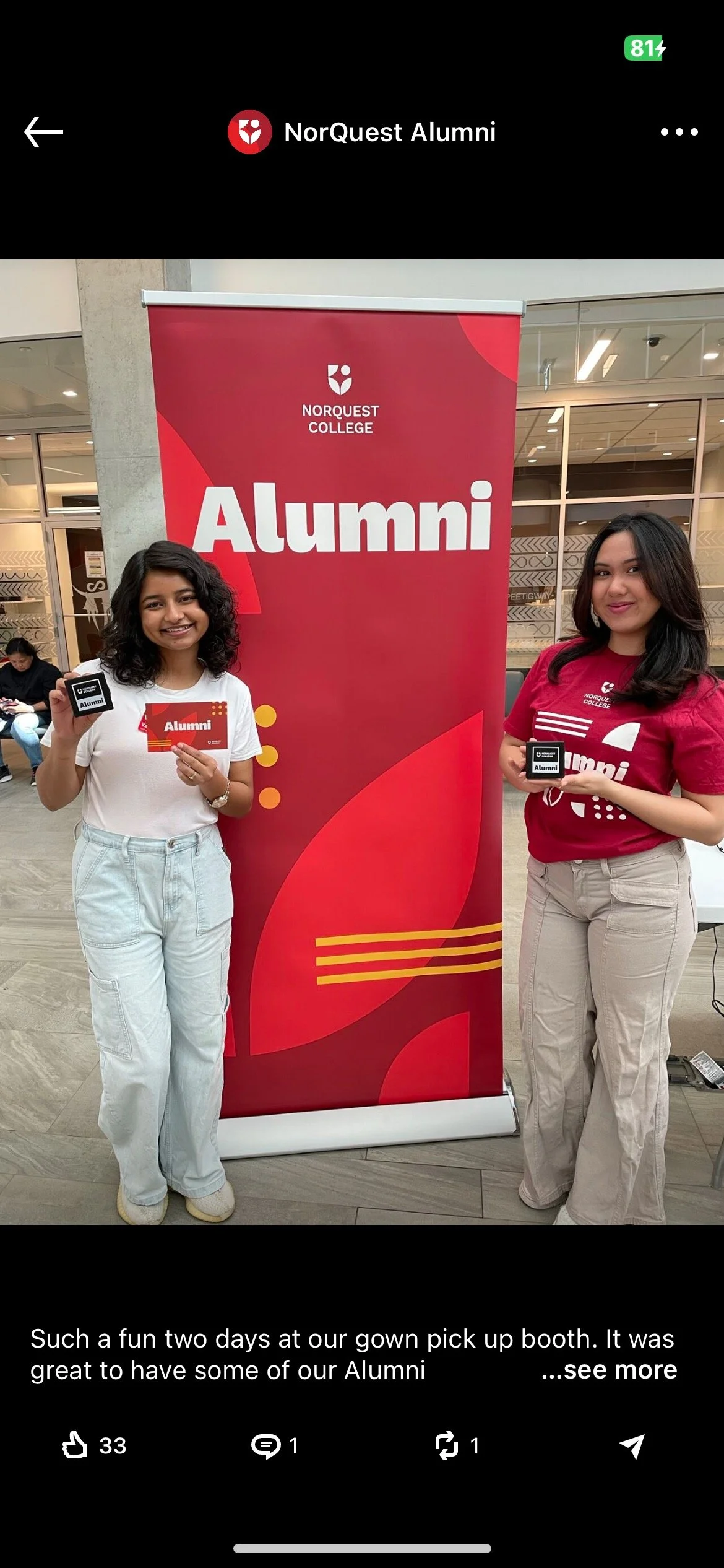
Together, we launched a centralized Brand Asset Library, where accessible templates and brand assets were made easily available à la carte—empowering employees to become brand champions with ease and enthusiasm.

2024
RGD In-House Design Award of Merit


Project Overview
-
Creative Strategist, Lead Accessibility & Inclusive Designer, | Co-lead Designer
-
Reimagine and evolve NorQuest’s brand through a phased, inclusive “brand evolution” strategy—ensuring accessibility, cultural responsiveness, and usability across all mediums and audiences.
-
I co-led the creative strategy and design for NorQuest’s brand refresh, leading while deeply rooted in inclusion, accessibility, and long-term sustainability and brand evolution. To ensure the brand truly reflected the diverse NorQuest community, I founded the Brand Working Group—an equity-led initiative that gave voice to Indigenous Peoples, racialized individuals, people with disabilities, and other historically marginalized groups.
My work led the research and integration of accessibility-forward design standards, including font and colour palette research, establishing a new baseline for brand inclusivity. I also partnered cross-functionally with the Accessibility and IT teams to launch an internal Brand Asset Library—a centralized website offering accessible brand templates and assets, including the custom brand font. This reduced friction for staff and empowered over 1,300 employees (82% of staff) to easily become brand champions.
Through brand presentations, staff training, and active participation in launch events, I helped embed the brand’s values across NorQuest. My leadership ensured each phase of the evolution was digestible for employees and achievable within existing workloads, allowing for a seamless rollout and adoption, by leading with empathy and understanding, and being guided by the goal of making these changes as easy as possible for everyone to activate.
Creative Expansion & Sub-Projects
NorQuest Accessible Atrium Pillar Vinyls & Building Branding
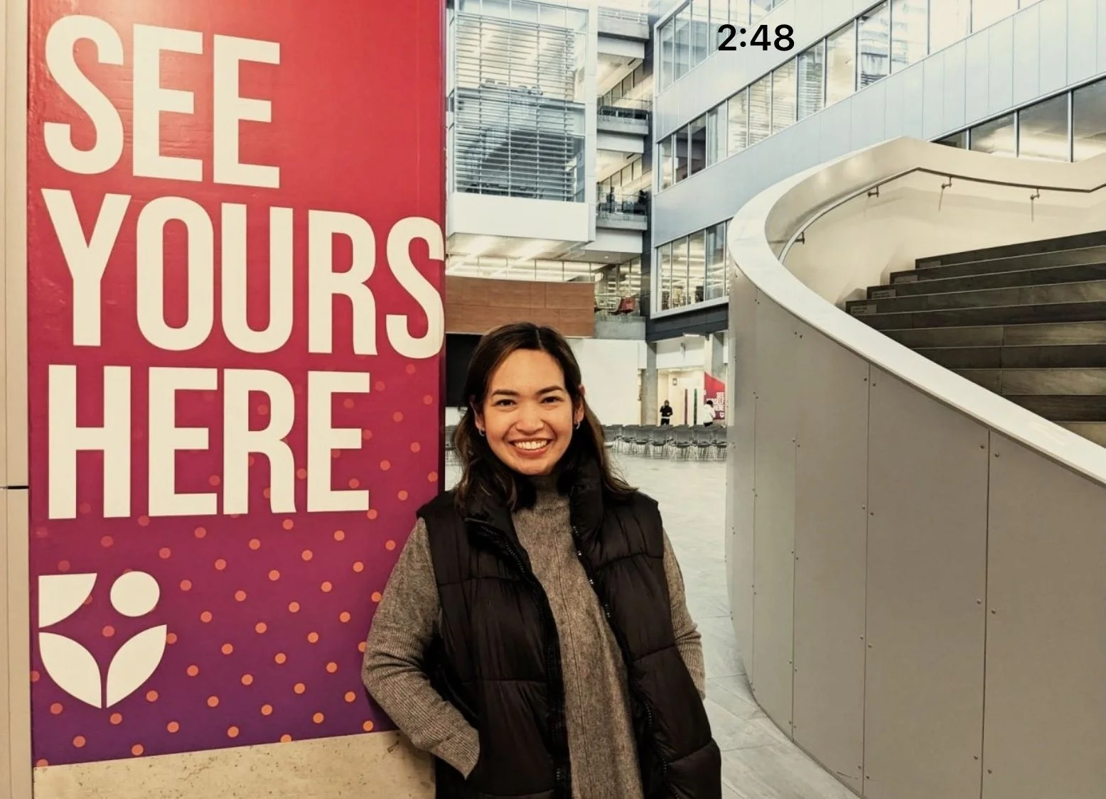
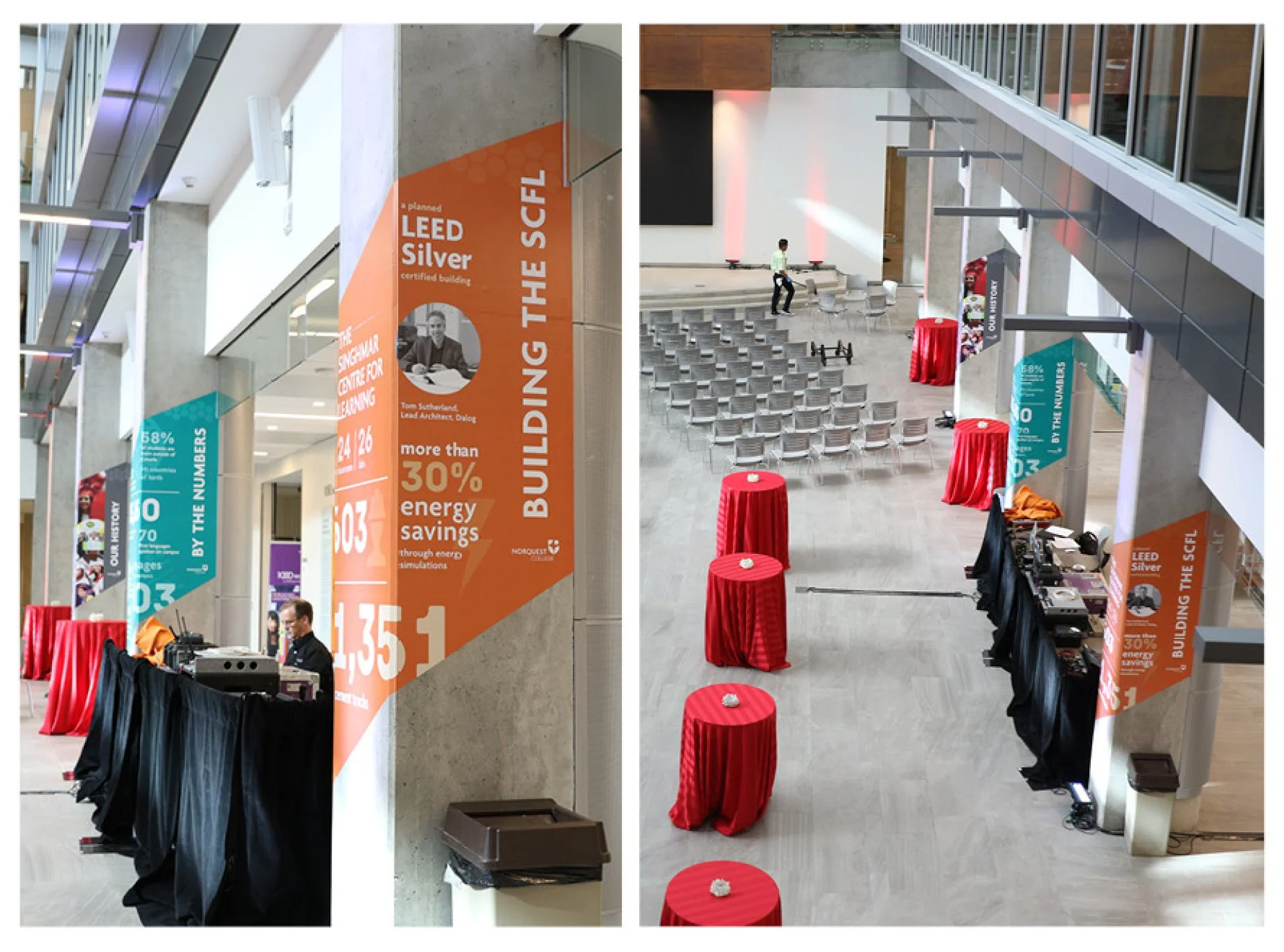
As Creative Lead on the campus pillar wraps, I transformed the stark atrium into a vibrant, on-brand, welcoming space through large-format vinyl applications. Working closely with the Accessibility Team and Facilities, the designs not only embodied the brand but added vital contrast for people with reduced vision—turning an austere lobby into a safe, accessible environment.
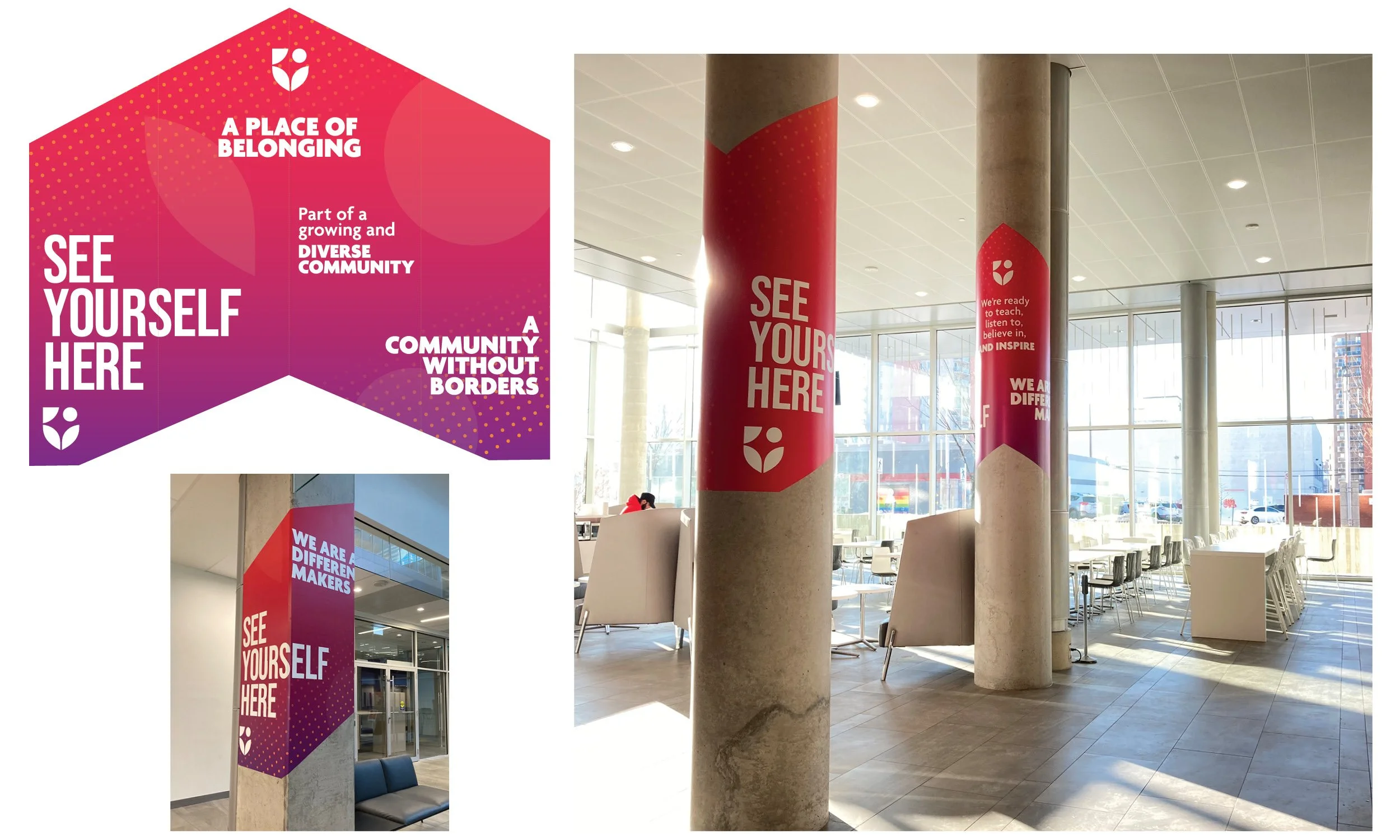
International CASE design and communications award (pillar wraps)


Creative Expansion & Sub-Projects
NorQuest Esports Identity
As Creative Lead for brand research and identity design, I extended NorQuest’s refreshed brand into the bold, fast-paced world of Esports.
The challenge: strike a balance between brand consistency and the distinct visual culture of gaming. I developed an inclusive visual language using energetic gradients and graphics that celebrate gender diversity and neurodivergence—while projecting a welcoming, fun, and authentic persona. The designs were met with enthusiasm from players, who praised the visuals as both exciting and true to the Esports spirit.

Creative Expansion & Sub-Projects
NorQuest’s Fundraising and Business Case Statement
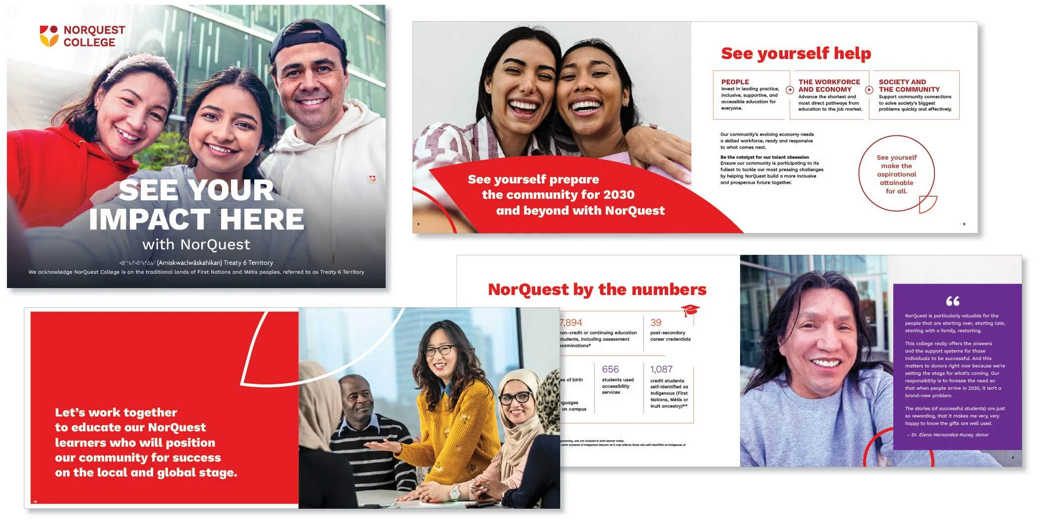
As Creative Lead, I brought the refreshed brand to life through NorQuest’s flagship fundraising and partnership publication. This high-profile piece set the visual direction for future marketing—integrating themed photography, infographics, and refined brand aesthetics. The Advancement team praised it for its clarity, vibrancy, and professional polish, calling it a standout showcase that left a lasting impression on key partners.
Impact & Recognition
The refreshed brand made a measurable difference—empowering employees, strengthening engagement, and being celebrated for its accessibility and innovation.
82%
Employee engagement with the Brand Asset Library with over 15,000 visits in two months
2024
RGD In-House Design Award of Merit
SILVER AWARD
CASE International design and communications, Silver Award for Atrium Pillar branding
Client & Team Feedback
“This [NorQuest] design team has taken our brand redesign work to the next level by extensively exploring whether our brand expression aligns with our stated values around inclusion.”
— Employee Culture Award nomination for: Start Small & Think Big
“Congratulations! So happy to see this Brand Asset Library come about!”
— Executive Admin Team
“I am using the letterhead template now and it’s great and sleek looking! Love the brand photos and Teams backgrounds. It’s so easy to access all these brand goodies!”
— Advancement Team Lead
“I LOVE the brand refresh! It’s bold, energetic, and vibrant!”
– Advancement Manager
“I think everything your team has created looks AMAZING, and I’m loving the new look.”
